
📑 Table of Contents
- Why do traditional Amazon listing audits miss conversion killers?
- What does a UX/CRO audit actually evaluate on an Amazon product page?
- How do you set up an AI-powered competitive UX audit?
- What AI prompts should you use for the audit?
- How do you prioritize and implement UX fixes?
- Frequently Asked Questions About Amazon Listing UX Audits
- Conclusion
⚡ TL;DR
- The Blind Spot: Traditional audits check for keywords but miss the visual friction that kills conversions.
- Mobile Reality: With 60% of traffic on mobile, desktop-optimized listings often fail where most shoppers browse.
- AI Advantage: Reasoning-capable AI simulates human user testing, evaluating listings against proven usability heuristics.
- Core Methodology: Audits must evaluate above-the-fold value, mobile scroll journeys, and competitive visual positioning.
- Actionable Prompts: Use the seven provided AI prompts to benchmark against competitors and find friction.
- Prioritization: Focus on the “Top 3 Friction Killers,” usually main image, bullet order, and trust signals.
- Validation: Verify AI-suggested changes with Amazon’s Manage Your Experiments tool to prove lift.
A listing that scores 95% on keyword coverage but converts at 8% is leaving money on the table, and keyword audits will never tell sellers why. The average Amazon conversion rate sits between 10% and 15%. When a product page falls below this despite perfect SEO, the problem isn’t visibility; it’s friction.
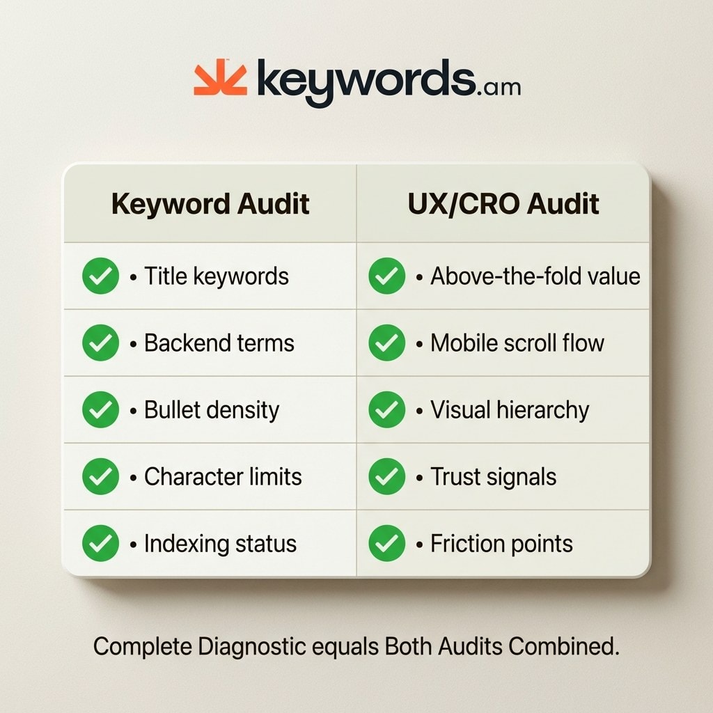
Traditional audits check if the right keywords are present. They verify title keywords, bullet density, and backend search terms. However, they don’t check if the listing actually convinces a hurried mobile shopper to hit “Add to Cart.” They ignore the visual hierarchy, trust signals, and the split-second decisions made on a smartphone screen.
This article provides a complete amazon listing UX audit methodology for using reasoning-capable AI to run a competitive analysis. With the 7 copy-paste prompts below, sellers can diagnose visual hierarchy issues, mobile friction, and conversion killers that keyword tools can’t see. While competitors focus on SEO, this diagnostic addresses the human side of the transaction.
Why do traditional Amazon listing audits miss conversion killers?
Traditional audits focus on keyword presence and density but ignore how the listing looks, feels, and flows to a mobile shopper making a 2-second decision.
Keyword audits are necessary but insufficient. A listing can score 100% on keyword coverage (perfect density in title, bullets, and backend) and still convert poorly. This happens because algorithms rank products, but humans buy them. The elements driving the “Add to Cart” decision are visual: main image quality, bullet order psychology, trust signal placement, and above-the-fold value proposition.
Moreover, 60% of Amazon traffic is mobile. Yet, most sellers design and audit on desktop. This creates a massive disconnect. A listing that looks persuasive on a monitor often appears cluttered or truncated on a phone. Bullets get cut off; images become thumbnails. Traditional keyword audits don’t account for these rendering issues, leaving mobile shoppers to encounter friction the seller never sees.
|
What Keyword Audits Check |
What UX/CRO Audits Check |
|---|---|
|
Title keyword presence |
Above-the-fold value proposition |
|
Bullet keyword density |
Bullet order psychology |
|
Backend search terms |
Mobile scroll journey |
|
A+ Content text coverage |
Visual hierarchy and image sequence |
|
Keyword indexing status |
Trust signal placement and visibility |
|
Character limit compliance |
Conversion friction points |
For a complete strategy, use Amazon listing audit tools for the keyword foundation. An amazon listing UX audit is the complementary diagnostic to maximize that traffic’s value.
What does a UX/CRO audit actually evaluate on an Amazon product page?
An amazon listing UX audit evaluates six dimensions keyword audits miss: above-the-fold value, mobile UX, visual hierarchy, trust signals, competitive positioning, and friction points.
Above-the-fold value proposition: 57% of viewing time is spent above the fold, and shoppers form aesthetic judgments in 50 milliseconds. The first 80 characters of the title, main image, price, and star rating must instantly answer the core question. If the value isn’t obvious, the shopper bounces.
Mobile UX and scroll journey: With 60% of traffic on mobile, the phone experience is primary. Mobile layouts shift dramatically. Bullets are truncated or pushed below A+ Content. The audit checks for “scroll fatigue” and ensures image sequences are swipe-friendly.
Visual hierarchy and image strategy: High-quality images can drive 15-30% conversion increases. The audit evaluates the hero image (does it stop the scroll?), infographic flow, and lifestyle vs. technical balance. It checks if images tell a coherent story without text.
Trust signals: Review counts, star ratings, and badges like “Amazon’s Choice” reassure buyers. Every 1-star increase can lift conversion rates by 4-5%. The audit checks if these signals are visible at critical decision moments.
Competitive positioning: Sellers rarely view their listing in the search results grid. The audit asks: does the product look like the premium, value, or generic option compared to neighbors?
Conversion friction points: These are barriers like unclear sizing, missing specs, or confusing bullet prioritization. Identifying and smoothing these is often the fastest way to lift rates.
Sellers can reference Nielsen’s 10 Usability Heuristics to understand the principles guiding these evaluations.
How do you set up an AI-powered competitive UX audit?
Gather mobile screenshots of the listing and three competitors, define a buyer persona, choose the primary conversion action, and feed everything to a reasoning-capable AI.
Step 1: Capture mobile screenshots.
Use Chrome DevTools to simulate a mobile device (F12 > Toggle device toolbar) or take scrolling screenshots on a phone. Capture the full product detail page for the listing and the top three competitors.
Step 2: Collect competitor URLs.
Identify the top three competitors for the primary keyword. Copy their URLs.
Step 3: Define the buyer persona.
The AI needs to roleplay the customer. Define who they are and what matters to them. Example: “Target buyer is a busy parent looking for a BPA-free water bottle. Cares about durability and easy cleaning. Price is secondary.”
Step 4: Define the primary conversion action.
Is the goal “Add to Cart,” “Subscribe & Save,” or “Learn More”? Clarifying this helps the AI evaluate the call-to-action.
Step 5: Package for the AI.
Upload screenshots and provide URLs, persona, and conversion goal in one prompt sequence. This works with Claude, ChatGPT, or Gemini.
What AI prompts should you use for the audit?
Seven targeted amazon listing UX audit prompts cover usability heuristics, mobile journey mapping, competitive benchmarking, above-the-fold analysis, a competitive matrix, SWOT analysis, and the cynical shopper test.
Prompt 1: Usability Heuristic Evaluation
Leverages established UX principles to find objective flaws.
Act as a senior UX researcher. Evaluate this Amazon listing (see attached mobile screenshots) against Nielsen's 10 usability heuristics, adapted for e-commerce.

Focus specifically on:
1. Visibility of system status (Is stock/delivery clear?)
2. Match between system and the real world (Does language match intent?)
3. Consistency and standards (Does it follow layout expectations?)
4. Recognition rather than recall (Is key info visible?)
5. Aesthetic and minimalist design (Is visual hierarchy clear?)

Score each heuristic 1-5 and flag critical failures.
Prompt 2: Mobile Journey Mapping
Identifies where mobile users get stuck.
Map the mobile buyer journey for the defined persona from search result click to "Add to Cart."

Analyze the screenshot sequence. Identify:
1. The first piece of information seen.
2. Critical information truncated or hidden.
3. The flow of the image gallery.
4. Flag every friction point or reason to abandon.
Prompt 3: Competitive Visual Comparison
Forces direct comparison with competitors.
Compare the visual hierarchy, trust signals, and mobile responsiveness of my listing (Image A) against these 3 competitors (Images B, C, D).

Specific questions:
- Whose main image is most clickable and why?
- Who communicates the unique value prop fastest?
- Which listing makes technical specs easiest to digest?
- What trust signals do they have that I am missing?
Prompt 4: Above-the-Fold Audit
Focuses on the critical first impression.
Audit the above-the-fold content: first 80 title characters, main image, price, and star rating.

Simulate a shopper giving this listing a 2-second glance.
- What is the primary takeaway?
- Is the key benefit visible immediately?
- Does the price/rating ratio build confidence?
- If the shopper scrolls no further, would they understand the product?
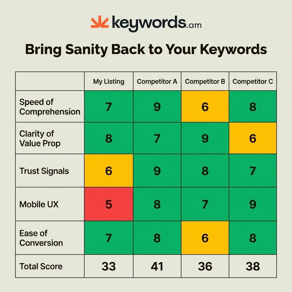
Prompt 5: Competitive Matrix
Creates a quantifiable scorecard.
Generate a competitive matrix scoring my listing vs. 3 competitors on (Scale 1-10):

1. Speed of Comprehension
2. Clarity of Value Prop
3. Trust Signals
4. Mobile UX
5. Ease of Conversion

Present as a table.
Prompt 6: SWOT Analysis
Synthesizes findings into strategy.
Based on the comparison, generate a SWOT analysis.
Strengths: What do we do better?
Weaknesses: Where are we losing?
Opportunities: Low-hanging fruit to fix immediately?
Threats: Competitor features posing the biggest risk?
Prompt 7: The Cynical Shopper Test
Cuts through analytical politeness.
The Cynical Shopper Prompt:
“Act as a cynical, hurried mobile shopper who has 3 other tabs open. You are looking for a reason to say ‘no’ so you can move on. What is the ONE specific thing that would make you close this tab and pick a competitor? Be brutal.”
For more on the methodology, read the Nielsen Norman Group heuristics.
How do you prioritize and implement UX fixes?
After completing the amazon listing UX audit, identify the top 3 friction killers using a low-effort/high-impact matrix, then implement quick fixes first and validate with A/B testing through Manage Your Experiments.
An AI audit generates many ideas, but sellers must prioritize. Use the “Top 3 Friction Killers” framework to find the issues costing the most conversions. These are usually a weak main image, poor mobile bullet order, or missing trust signals.
Prioritize with a Low-Effort / High-Impact Matrix:
- Quick Wins (This Week): Reorder bullets to prevent truncation, adjust titles, or swap the main image.
- Medium Effort (This Month): Design new infographic images, redesign A+ Content, or add comparison charts.
- Strategic Changes (Next Quarter): Professional photography reshoots, video creation, or brand story overhauls.
Validate fixes using Amazon’s Manage Your Experiments tool. Amazon data shows experiments can drive up to a 25% sales increase. Test the new version against the control to prove the lift.
Measure impact by tracking Unit Session Percentage in Business Reports. For setup guidance, see the Amazon A/B testing guide. For the keyword side, the Amazon listing audit tool ensures a solid foundation.
Frequently Asked Questions About Amazon Listing UX Audits
Conclusion
A complete amazon listing UX audit pairs keyword audit tools with this AI-powered UX/CRO methodology to find every conversion gap.
Keywords drive traffic, but user experience converts it. Relying solely on keyword audits leaves sellers blind to the friction points causing abandonment. By combining keyword tools with AI-driven UX auditing, sellers see the full picture.
The “Top 3 Friction Killers” framework prevents analysis paralysis. Identify the critical visual elements depressing conversion and address them. AI makes professional-grade auditing accessible, but success requires validating insights with A/B testing.
For immediate impact, run Prompt 7 (the cynical shopper test) on the top-selling listing today. It reveals the biggest obstacle between browser and buyer. For foundational keyword analysis, rely on Keywords.am’s listing audit tool, because a complete diagnostic requires both optimized search terms and an optimized user experience.